THE OFFICIAL WEBSITE OF THE BOOK

The Power Pack Package Part 2:
Ken Reid! Volumes 1 & 2 - a review, plus interview with Irmantas Povilaika, the man behind getting the books together
Please note: copyright of all images used here is with their respective owners. Any such copyrighted material is used exclusively for educational purposes and will be removed if requested by the copyright holders.
All words and phrases highlighted in blue are explained in a vocabulary list at the end of this page.


My copies of the book on a nice flowery tablecloth, and the slipcase that was included for the IndieGogo backers of the book... which, sadly, I wasn't... :-(
Well, we can just sum this up just like other similar reviews of the books: FANTASTIC! TERRIFIC! (With maybe some POW!, SMASH! and WHAM! added.)
This strange introduction to this review is based on the names of five comics - collectively known as the power comics - from the mid-sixties.
Ken Reid! His complete WHAM!, SMASH! and POW! strips Volumes 1 & 2 (Or, if you were an original IndieGogo backer, the Power Pack of Ken Reid as these books were presented as a slipcase edition and presented as, well, a pack, of course!) collects all the cartoon strips drawn by Reid for these magazines.
However, getting them together was not that easy a process, so here's some background on getting the books together and about the man himself.
To British comic fans, Ken Reid is considered a comics legend, and is regarded as one of the four greatest of the period (along with Dudley D. Watkins, Leo Baxendale and Davey Law). Born in 1919, Reid's first work was for the Manchester Evening News with 'The Adventures of Fudge the Elf', a children's three-panel strip a long way away from the art we know today. After the Second World War, he joined the oldest and most established comic publisher, Amalgamated Press, and drew strips in the style of regular artists. Later Reid joined DC Thomson as a freelance artist and started drawing a regular half-page strip called 'Roger the Dodger' for The Beano. He drew other strips, also for The Beano's sister comic, The Dandy, but perhaps his best known strip of the period was 'Jonah'. a mariner who had the unusual habit of sinking every boat he was on! It was probably at this time that Reid's attention to detail, and the distinctive style of his comedic and grotesque characters came well and truly into being. But to the surprise of DC Thomson, Reid left in 1964 and joined Leo Baxendale (at his request) at Odhams Press, to produce new strips for a new comic, WHAM!, described by Baxendale as a 'Super Beano'. The artwork is perhaps Reid at his very best, and you can see why in the resulting collection that we find in these two books.
And now onto the books. As this was going to be a solo enterprise from Irmantas Povilaika, there was going to be a problem funding the costs of production, substantial enough to be not only a potentially risky investment, but for an amount well outside the reach of the everyday individual; he chose to invest his own cash into their production. However, he had to pay for the licence in advance to reprint the strips, along with the people who had to scan and clean up the comics, design the layouts, and of course, to print the whole thing. To help him recover these costs, it became necessary to raise the cash through IndieGogo, an international crowdfunding website. Those who supported his campaign were additionally rewarded with the books presented inside a slipcase, along with free prints of the original artwork.
The presentation is faultless, although it would perhaps have been nice to perhaps offered the slipcase for a little extra cost, but that would, of course, have taken away one of the incentives of supporting the production in the first place.
Volume 1: FRANKIE STEIN and JASPER the GRASPER

Two different stories as to how Frankie Stein was created: First, Ken Reid's slightly unsettling visuals - that we are actually seeing a continuous process of Frankie coming into existence (WHAM! 11 July 1964) - was later changed to the more traditional story in the FRANKIE STEIN annual, cover dated 1976. The art is by Frank McDiarmid.
This volume features his most popular strip, 'Frankie Stein', a comical version of the Frankenstein monster, who was built by Professor Cuthbert Cube as a playmate for his son, Mickey. Unfortunately, the result was not only a dumb but lovable monster, but also ghastly (to all the other characters in the strip, but not to us comic fans, of course!). With a frog's brain and enormous strength, Frankie would cause mass destruction to Mildew Manor, cost a fortune in bills to the professor for all the damage caused everywhere, and considerable amounts of money in food. Eventually, the embarrassment of it all leads to Professor Cube, in the final strips, regularly trying to come up with plans to 'getting rid of the big lunk forever'.

For our English students: on page 87, frame 9, Professor Cube, having just lost all his teeth, is actually saying: 'Get after the flaming fool, you fathead, and collar him! I can't go out looking like this! I'd be a laughing stock!' During this period, Reid's strips were often filled with mangled English and exaggerated dialects. ('What can I do to get him with a hand like this, you toothless idiot?)
children's comic elsewhere. Another interesting observation is the title panel at the top: midway through the book, the panel is cut on the right, removing a group of terrified people, and having the words 'the friendly monster' placed there - a problem at editorial with the original people? Later, the words are moved to one line above, and a truly awful drawing of 'someone' with a fang put in its mouth- definitely not Ken Reid.
When some of the strips were reprinted some years later, IPC - the company that had taken over Odhams - chose to reletter the speech balloons and amend the dialogue, often 'simplifying' it, removing the dropped letters and regional dialects to more 'appropriate written English'. The black and white original version is from WHAM! and the colourised IPC version appeared in the SHIVER and SHAKE annual 1974. Spot the differences...
'Jasper the Grasper' is perhaps better known to the slightly younger readers as a character from Cor!!, a comic from 1971 (and drawn by a

Jasper the Grasper from WHAM! (8 May 1965). The character was later revived in 1972 in COR!!, with art by Trevor Metcalfe.
The next thing to observe is that these strips are obviously a product of their time, and would certainly not be allowed in modern children's comics today: we can observe numerous characters smoking (pages 16, 23, 24... and so on!), a bit of casual racism with accents (p.149 with the Irish, p.130 with Frankie putting on an 'allo 'allo accent, p.97 with German and, wow, Frankie with German measles on page 148 - except the measles spots are tiny swastikas!!), and even some frames that make it clear Professor Cube wants to kill himself (pages 13 & 140!).
The detail is Reid's drawings is a delight to see, an artist free of restrictions imposed on him at DC Thomson (and later restrictions by IPC magazines) and being able to be let loose with true, comic horror. (English students: comic horror: comedy to be found in the horror genre; horror comic: a comic whose strips are of the horror genre, and are not necessarily comedic!) For our English students, the language is certainly funny, but it may not be always comprehensible as the characters often speak with dialects, accents, or as a result of losing all their teeth (see the example), But in the context of the story which you have to see, it seems perfectly understandable.
Most of the episodes are one-off stories. The only time there is any kind of ongoing storyline is at the beginning, when Frankie was created; later, when Frankie gets lost, eventually found by Mickey and gets lost again; and where he stays with 'Madam McAbre's Academy for Frustrated Freaks'; '...I've had this nice circular (leaflet) by some nice muvverly Scottish lady who understands boys like me - so I'm going to live there!', which allows the opportunity for Ken Reid to draw up all kinds of weird and wonderful malformed individuals which, in these politically correct sensitive times, would unlikely be reprinted in any

Two versions of the same strip. Note the dialogue changes to remove the more colloquial language (and reduce the amount of vocabulary!), and the subtle artwork alterations for resizing (how many eggs?) in the colourised version. Plus Ken Reid's signature has been whitened out. It wasn't until after the mid-seventies that IPC (and much later, DC Thomson) finally allowed artists to sign their work!
different artist), but its roots are here, from WHAM! in the form of just six, two-page strips, with Reid's grotesque artwork particularly suited to the fact that the strip was deliberately set in the Victorian period. Jasper is basically a Victorian miser, a man who would not only look for ways to avoid spending money while simultaneously increasing his horde of cash, but was able to identify any coin roughly where it had been dropped just from the sound, running at supersonic speed to get it! He would often do things - illegal or otherwise - for more money, but he would usually lose out at the end. For our English students, there is one piece of observation I'd like to pick up on here: on page 160, Billy Bunn the Errand boy, who is telling us all about Mr. J. McGrabb, flicks a coin in the third frame. The sound effect word is 'Flick'. This is interesting as there is/was a comic edict that makes it clear that you cannot use the words 'FLICK' and 'CLINT' because, if there was a smudge in the printing process, these words could look very different! (Although here there's no mistake in what it's meant to say.)


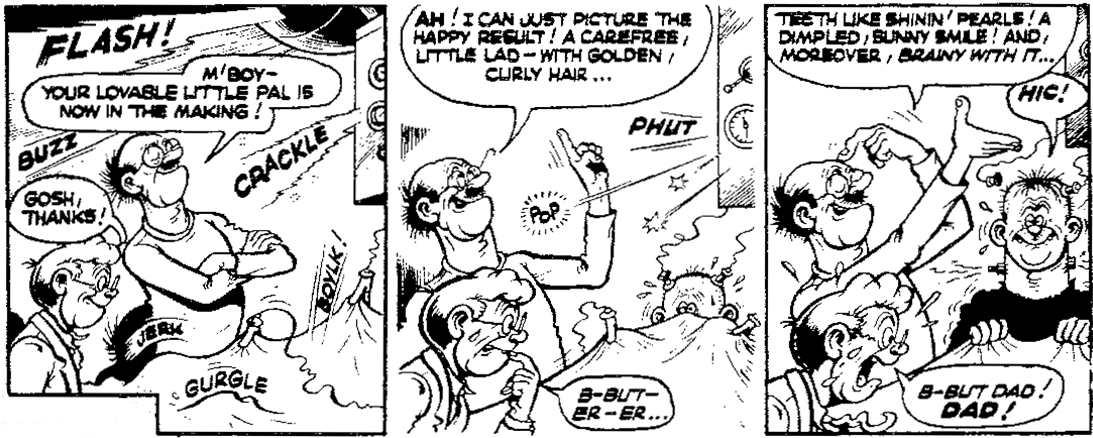
Someone attempting suicide would never be accepted in children's comics today, as seen in the first picture, published in WHAM! 25 September 1965. In the second picture, the arm and gun have been whitened out and the dialogue changed as part of a continuing story (Professor instead of Dad?), published in the FRANKIE STEIN 1976 annual.
Volume 2: QUEEN OF THE SEAS, DARE-A-DAY DAVY and THE NERVS
I was looking forward to this volume as while I was aware of the strips, I hadn't read any of them before. (Some of the 'Frankie Stein' strips had been reprinted in Shiver and Shake, mainly in the annuals and holiday specials, although they were often edited.)

Captain Enoch Drip and his one-man crew, Bertram Bloop, from SMASH! , published 23 April 1966. Note that smoking characters were considered acceptable in children's comics in the sixties.
So to 'Queen of the Seas'. One has to say that these strips are superbly drawn as we follow the adventures of Captain Enoch Drip and his one-man crew in the form of Bertram Bloop, who's often the one bossing his extremely stupid (and seemingly chain-smoking with his cigarette holder fashion accessory) captain around. We witness their boat, the "Buoyant Queen", being sunk endless times, the pair getting into all kinds of unlikely trouble with other ships often manned by nervous skippers or incompetent doctors, or all manner of weird and wonderful characters who just happened to be there and help cause the resulting chaos. Some of the strips often form complete narratives that run to several pages, and with the level of detail placed in the pages, it is a strip that you would have to go back and look again otherwise you'll miss something.
Unfortunately - but this should be with a very small 'u' - it is the one strip where a small number of the reproductions - the source material being the fifty-year old comics, remember - have been difficult. Part of the reasons for this is that the later strips in Smash! were printed in colour, but on newsprint, and the original colour processes were poor. It was decided to reproduce these in black and white rather than include the colour to show off Reid's artwork, and while it was the best decision, pages 52 and 58 do suffer a little.
Now 'Dare-A-Day Davy' is perhaps Reid at his most manic, and indeed the strips contain many new ideas or even a source of ideas to come. It's interesting to note you can see all these new ideas being added as you read the strips in order.
'Dare-A-Day Davy' is mainly a set of single page strips for Pow! (then later, Pow! and Wham!) where the eponymous character's main problem is that he can never resist taking on a dare, and as a result often gets into all sorts of trouble as a result (because he usually fails). The dares were often downright dangerous, but with wonderfully graphic relish, Reid shows poor Davy after often being 'pummelled', 'pounded', 'pasted'. 'marmalized' and all kinds of wonderful adjectives that describe his fate, usually after some kind of fierce beating and battering, suffering injuries that would be the kind that would take months to recover from, and having got through several sets of teeth (as referenced in the strip on page 139) on the way!

Davy's first appearance, as it appeared in the actual comic in POW! Issue 1, 21 January 1967. And that's the quality of the colours used...

The last panel of the strip published in POW! and WHAM! (another comic merger), issue dated 3 February 1968 showing the inevitable consequences of Davy's latest dare - beaten up and lost teeth...
Later, we're introduced to two characters representing Davy's dual conscience (Willy Power and, later on, Dave Hyde, looking like the clearly evil version of Davy himself), and then the 'schizoscope' which showed the 'inner self' of the readers who send in suggestions for Dares (and in my mind, the inspiration for Reid's classic 'Creepy Creations' from 1973-74's Shiver and Shake). Even the Odhams staff are involved regularly, with endless references and cartoon caricatures of editorial. (On a side note of this fact, it's interesting to see that one of these 'characters - 'Bart', a member of editorial for what was quite a liberal comic for the time - would actually create problems towards future artists and editors at IPC.*)
Reading it through now, you would often wonder how such a strip could end up in a children's comic! Indeed, another observation here is the considerable amount of writing to be found in the speech balloons and panels - something IPC would cut right down on in Ken's later strips and even in reprints. The fact is, Odhams gave the writers more freedom than DC Thomson or Fleetway/IPC (one of the reasons Reid
left DC Thomson to go to Odhams). Interestingly, one strip that wasn't published is reproduced in this book as even Odhams appeared to consider it too graphic! Interestingly, one character made an appearance in the newly merged VALIANT and LION comic on 25 May 1974, but was known as 'Challenge Charlie!'. Drawn by Frank McDiarmid, it was clearly inspired by Davy to the point that the character not only looked like him, the strips even used some toned-down versions of the original 'Dare-a-Day Davy' scripts!
But if Ken Reid's 'Dare-A-Davy' could be considered a little gruesome in detail, well, 'The Nervs', took it all one step further.


Fatty and the Nervs in full Ken Reid glory. From SMASH! incorporating FANTASTIC, published 22 February 1969.
Taking over from another artist (Graham Allen), Reid's version would prove tricky for Odhams (Reid would occasionally sneak 'objectionables' into the frames), and even more so for IPC (who took over Odhams), who would then choose never to reproduce the strip!
'The Nervs' featured a character simply called Fatty (a name that would never be used now), and all his internal bodily organs who were in fact being maintained by a group of human-like creatures - the Nervs - each assigned to look after the various departments of this rather obese and not very intelligent character. Essentially, the strip would depict the Nervs as a society where it was, in fact, Fatty's body that was their world! The adventures would be when Fatty would make some kind of choice - usually because of food - and the Nervs' reactions accordingly, using their own machines and equipment to fix things or influence Fatty! This is one of those strips that you have to read - and admire the art - to believe...
One interesting observation of 'The Nervs' is that despite 23 two-page episodes, the strip first appeared in Smash and Pow!, then in the clumsily titled Smash! and Pow! incorporating Fantastic, then five strips later, Smash! incorporating Fantastic.
Each of these books contains special introductions: Steve Holland (comics historian) for volume 1, and Nigel Parkinson (comics artist) for volume 2. Irmantas has also successfully
managed to put together a quite detailed biography of Ken's work for this period, which reveals that while Reid had his funny and dark side of cartooning, he also suffered with illnesses and with his personal life. Both these books also have additional introductions by Ken's son, Antony J. Reid.
So would I recommend these books to learners of English? Of course I would! But if we had to, well, throw some negatives into this for those readers, the colloquial language will take a little getting used to. And then some will perhaps balk at the price: individually, each book costs £25.99 each, or both at a total of £49.99, plus the additional cost of postage and packing. You can order them at www.kazoop-comics-shop.com . Incidentally, do check the price for your own country; I calculated I saved four pounds when I ordered them in zlotys (not pounds) from my Polish bank account.
And now... the man who put all this wonderful material together!
Part 2: An interview with Irmantas Povilaika on 'the Power Pack of Ken Reid'
How big is your collection of comics from this period (1960s-1970s?)
I have complete (or almost complete) sets of most of the Fleetway /IPC titles: Buster, Giggle, Jet, Jag, Valiant, Cor!!, Knockout, Whoopee!, Shiver and Shake, Monster Fun, Misty, Scorcher, Krazy, Cheeky Weekly, Wow, Jackpot, Oink. Plus the full sets of all the Power Comics – Wham!, Smash!, Pow! Fantastic and Terrific. I also have quite a big collection of DC Thomson comics – The Beano, The Dandy, The Beezer, Nutty, Plug, Hoot and Sparky. I also like the young children’s comics and magazines such as Playhour, Jack and Jill, Treasure and Once Upon A Time, and have complete sets (or complete sets of the periods I am interested in) of those publications. There is some amazing artwork in them! That’s a lot of comics!...
Why the particular fascination with Ken Reid (which I perfectly understand!)?
The first time I saw Ken’s work, I was instantly captivated by his distinct style and the twisted sense of humour. In my opinion he stood high above most of his contemporaries who worked in children’s comics, and, differently from Leo Baxendale, he was practically inimitable.
From your perspective, is it easy to understand the strips? There are a lot of colloquialisms, dropped letters and all kinds of speech from cartoon characters who have been affected by missing teeth and posh language…!
I don’t have any problem understanding Ken’s strips and language, although I can see how the things that you’ve mentioned above might make it difficult for non-native speakers to fully appreciate Ken’s humour. My advice to anyone facing such problems would be to read more of Ken’s strips and get a feel of his language – it will grow on you before long. Some of Ken’s language is unique – I don’t remember others using words like 'clobberation', 'spifflication' etc., while some of Ken’s sound effects were his own invention - cartoonist David Rooum, who met Ken at one of the Cartoonists’ Conventions in the ‘60s, remembers Ken

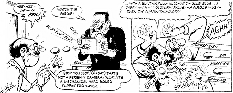
Professor Cube about to apply some 'spifflication' on Frankie. From WHAM! issued 5 November 1966.
telling him that he was in the bath when he invented 'bloylp' and other sound effects accompanying the sinking of a ship in 'Jonah' (From DC Thomson's The Beano, 1958-1963).
Why did you decide to try and publish the Ken Reid strips from the Power comics?
Since the early days of my collecting hobby more than ten years ago, I was always puzzled about the absence of collected editions of iconic British strips by the country’s best illustrators, particularly in comparison with the works of their American and European counterparts. I felt the British comics heritage should be celebrated in the same way and that there might be a market for nicely-done album collections. When I finally made up my mind to try myself as a publisher, I decided to go for the best strips by my favourite artist – Ken Reid. I am glad that times are changing, and Rebellion - as well as a few independent publishers - are now filling this unfortunate gap, and I am proud to have made my contribution by preserving and showcasing a brilliant period of work by one of the Britain’s finest.
Were there any difficulties in getting them published?
The biggest difficulty was finding out who the copyright belonged to, and it turned out I was banging at the wrong door for quite a while. But once I found that out, things went pretty smoothly. I decided to try and raise funding using one of those crowdfunding platforms. The response was great and the campaign ended at 150 per cent of its goal, with supporters not just from the UK but all over the world - the USA, Canada, Australia, New Zealand, Ireland, Spain, Germany, Greece, France, Switzerland, Malta, Gibraltar, etc.!
How easy was it to obtain such excellent reproductions since the source material had to come from the original comics – now over fifty years old?
I paid particular attention to reproduction quality. The art was scanned from original paper comics and required meticulous cleaning, particularly 'Jasper the Grasper' and some of the 'Frankie Stein' episodes where Ken used grey wash. I wanted to preserve the greys but remove the see-through effect resulting from the thin paper stock used for the comics. I also made the decision to remove the ugly colouring of 'Dare-A-Day Davy' and 'Queen of the Seas' strips. Ken drew his pages in black and white, so I thought reproducing them in b/w would be more appropriate and closer to the look of the original drawings. There was also the aspect of cost – colour pages would have meant greater printing costs, but since the colouring was rather poor, I though it made no sense to reproduce something that wasn’t done well and pay more for the books. That said, the pages of 'Frankie Stein' from the annuals are reprinted in full bright colour in Volume One of my collection. I am quite happy with the result, and my buyers think so too.
How much was Ken Reid’s son, Antony, helpful in getting these books together?
Antony was indeed very helpful in putting the books together. He allowed me to use materials from his dad’s archive (letters, unpublished drawings and sketches). Some of the materials are reprinted in the books, and served as the basis for my research in writing a detailed biography of the artist covering the years when he worked for Odhams Press (the original publishers of Wham!, Smash! and Pow!). A two part biography is included in the collection. Antony also wrote interesting introductions to both books, sharing the memories of his eccentric dad.
Have you seen Rebellion’s reproductions of Ken’s work, particularly 'Faceache' and 'Creepy Creations', and what do you think?
I have seen both books and think they are great. Moreover, I was involved in the production of both: I helped Rebellion with some general info for the 'Faceache' book, and wrote an intro to the 'Creepy Creations' collection.
Is there any other Ken Reid work you’d like to see published, or for that matter, any other classic artists from the 60s and 70s – for example, Leo Baxendale, Robert Nixon, Mike Lacey, Graham Allen?
I look forward to further 'Faceache' books and especially the 'World-Wide Weirdies' collections from Rebellion. I would be delighted if DC Thomson decided to collect and reprint Ken’s 'Jonah' from the Beano. I think 'Scream Inn' and 'Spooktacular 7' by Brian Walker would also make an excellent album, and a very thick one! Leo Baxendale did some memorable work for IPC, and I am delighted Rebellion will be publishing a 'Sweeny Toddler' collection later this year.
Is there any other British strip you’d like Rebellion – or even DC Thomson – to see being collected into an album?
I hope the success of the books put out by Rebellion will encourage DC Thomson to start their own line and they will publish complete collections of Leo Baxendale’s work – 'When The Bell Rings', 'The Bash Street Kids', 'The Banana Bunch', 'The Three Bears', and 'Minnie the Minx'. I would also buy 'Dennis the Menace' by David Law.


FACEACHE: Perhaps Ken Reid's best known strip. CREEPY CREATIONS: A collection of fun monsters inspired by reader suggestions. SWEENY TODDLER: A Leo Baxendale classic, originally from the 'Shiver' section of SHIVER and SHAKE. KEN REID'S WORLD-WIDE WEIRDIES: More fun monsters from reader suggestions, this time from WHOOPEE! & SHIVER and SHAKE. 'Sweeny Toddler' and 'Worldwide Weirdies' will be available later in 2019.
Would you say this kind of humour is particularly British, or do you think it could appeal elsewhere – perhaps in the hands of a good translator?
Many of those strips deserve to be celebrated for the top-quality artwork alone. I know some of Leo Baxendale’s work for Wham! ('Eagle Eye-Junior Spy') was reprinted in France, so I believe it has a universal appeal that goes beyond Britain.
COMING UP:
Part 3 of my interview with Irmantas Povilaika continues here, when I discuss the fact that his English appears to be excellent - where did he learn, did comics play a part in picking up the language, and any other problems with English.
Irmantas Povilaika is a keen collector of British humour comics of the 60s and 70s, and has a blog that shares, as he says, his 'humble knowledge about different titles, favourite characters and creators'. Check out his blog, which he updates regularly, at http://kazoop.blogspot.com. He is a regular contributor to the Comics Scene UK magazine and has also assisted in the production of Rebellion's humour editions from their Treasury of British Comics collections.
slipcase edition - a protective case for a book or set of books that is open at one end so that only the spines of the books are visible
mariner - another word for sailor
solo enterprise - here, to do a task alone, to chooses to go into business for him/herself (“go solo”), or work with others
to be well outside the reach of the everyday individual - to cost too much money for the average person
slightly unsettling visuals - here, art that gives the observer a feeling of being a little uncomfortable
ghastly - very unpleasant, very not nice
restrictions imposed on someone - rules by an individual or organisation that have to be obeyed by an individual, even if they may be strange or unnecessary
genre - a particular type of literature, painting, music, film, or other art form which people consider as a class because it has special characteristics
malformed - to not have the shape or form that a person is supposed to have
grotesque - here, when the artwork reaches the point that it is unnatural, unpleasant, and exaggerated
miser - a person who hates spending money
horde - here, having an amount of money that is very large
smudge - a dirty mark
casual racism - to be racist in a casual fashion, sometimes without either realising it or doing this in a period where it was not considered incorrect but in modern times would perhaps be considered offensive
German measles - a disease which causes you to have a cough, a sore throat, and red spots on your skin
newsprint - cheap, fairly rough paper on which newspapers and many comics are printed
eponymous - the character in a play, book or comic whose name is the title of that play, book or comic
taking on a dare - to do a challenge to prove that they are not frightened of doing it, to give someone a challenge to do something dangerous or frightening
wonderfully graphic relish - to get a lot of enjoyment out of doing certain drawings
gruesome - extremely unpleasant and shocking
one step further - here, to add something more to something that is already being taken to some kind of limit
objectionables - here, things that could be considered to be extremely offensive and unacceptable
obese - extremely fat to the point that this is considered very unhealthy
balk at the price - to not want to pay a certain amount of money, usually because it is too much money
to be captivated - to be fascinated by something, to be attracted to it
distinct style - to be different or separate to other ways of doing things
twisted sense of humour - to not have a usual way of thinking about humour, perhaps by making jokes or finding funny situations that people don't find funny and may even feel offended by them
to stand high above contemporaries - to be so much better than others in the field or business they work in at the time
inimitable - to describe someone, especially a performer, when you like or admire them because of their special qualities
to be meticulous - to do things very carefully and with great attention to detail
grey wash - a thin layer of grey colour that is added to a black and white picture